Design Manifesto Brochure Design
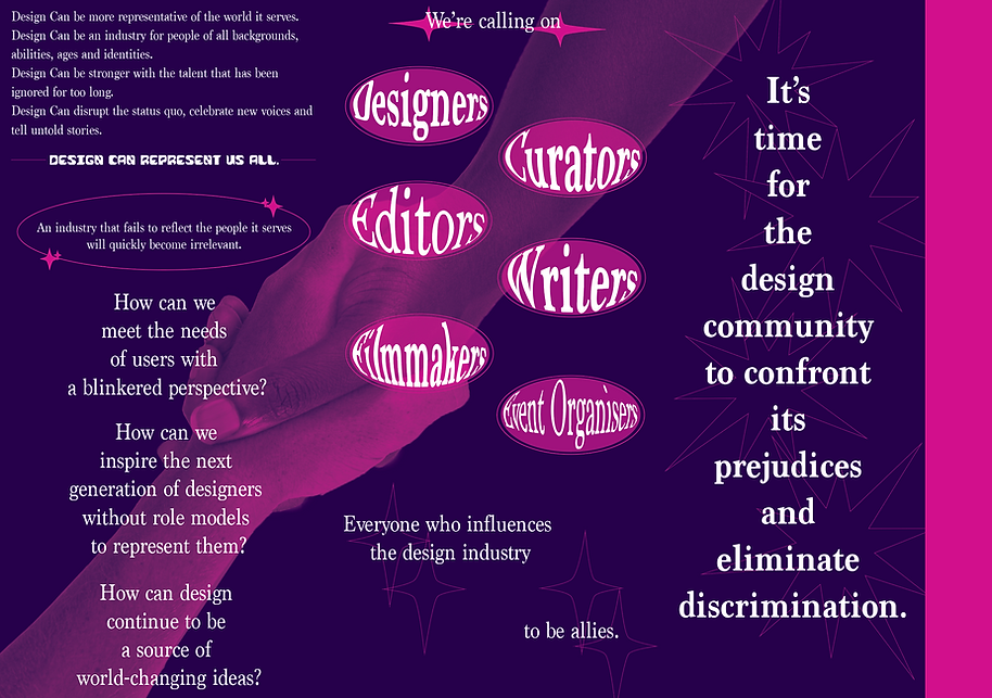
We were tasked to design a brochure with the content titled The Value of Design, A Design Manifesto. We were allowed to research existing design manifestos to use as our content. I used the manifesto from https://www.design-can.com/ as I felt that it was fitting to the title of our project and they have a strong message they are trying to bring light to the public.
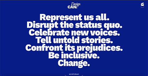


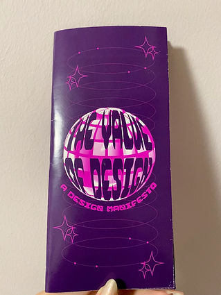
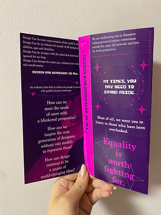
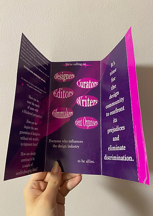
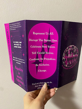
We had the creative freedom on the design of our brochure but it had to cater to a theme or event and we were only limited to using two colours only. The theme I chose to work on was based on Singapore’s nightlife as the covid-19 measures were slowly being lifted during this assignment. The manifesto addresses the fact that discrimination is still prevalent in society. In a design industry, we should be more inclusive of people from all backgrounds. Oftentimes, people get ignored or opportunities would be stripped away from them due to various aspects such as gender, identity or age. We should be accepting of new voices and we should be able to represent everyone. My objective was to convey the message of the manifesto effectively using strong graphics and visuals. To ensure that the material of the brochure is able to withstand for long periods of time. Consider how the publication unfolds and how it can serve more than one purpose, increasing the lifespan of it. I knew that I wanted to make use of vibrant colours and eye catching graphic elements. I was inspired by futuristic art styles which are currently trendy hence, appealing to a wider audience. Using duotone colours was a reqirement so I had to ideate various colour schemes to see which would be the best fit.
Front:

Back:
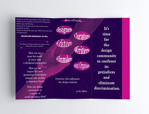
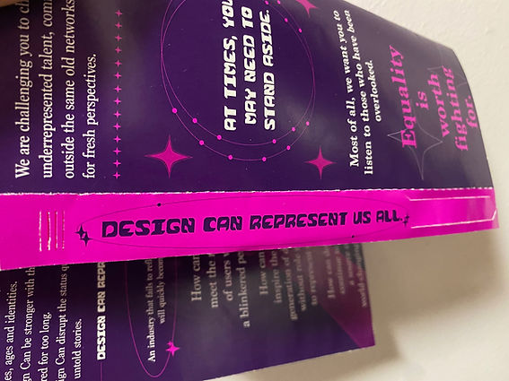
Rationale: I designed my publication this way as I felt that simplicity was the better route. I wanted to include bright colours and lots of graphics, so overcomplicating the design would be too overwhelming. This would also ensure that it's not too inconvenient to carry around as my event is in a nightclub setting. The lights would be quite dark so the words still need to stand out and effectively convey the message. Additionally, there is a part of the brochure which is the wristband that can be torn off and worn. It is convenient and there is also a common practice where people would keep the wristband as a memory. The paper I chose to print my design was a glossy lightweight paper as it can withstand water and is more durable which would not tear easily.
Call To Action: I hope that the viewers would be able to understand and have a changed mindset toward being more accepting towards people of different backgrounds by paying attention to those who have been overlooked. They can also choose to keep the brochure and the wristband to either display on a wall, keep it as a memory or re-read the brochure to remind them. Spread the message to promote a change in the industry. Eliminate discrimination and prejudices of all backgrounds such as gender, age, abilities, or identities.
I enjoyed the process of creating this brochure as I was finally able to explore my own creativity and finally have the freedom to design something on my own terms. This allowed me to not be afraid of trying something new and having fun during the process as it reflects in my work.
Front:

Back: