
Milk Carton Design For Gym Regulars
We were tasked to redesign True Dutch milk cartons and this particular theme was to cater to gym regulars. This assignment was to help us dive into packaging design.
Draft:

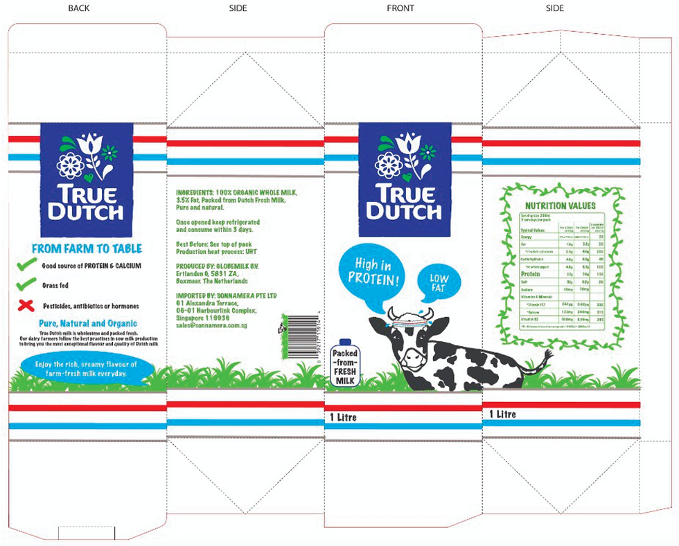
Flat Layout:
Barcode Design:

Rationale: I wanted to incorporate a simple theme and graphics related to gym and exercise as people who are health conscious would want to look out for important information such as “High in Protein”, “Low Fat” and nutritional information. I wanted to also add "Organic whole milk" because this phrase can be seen in their original packaging. I also thought that having a cow illustration wearing a sweatband on its head tied in with the overall theme along with the sweatband design around the milk carton. I felt that it was able to catch the attention of the target audience since it is something that is relatable to them.
Process: I had to look up visual references on the layout of milk cartons to figure out where to place specific elements. I sketched out the design on Procreate first before implementing and refining it in Adobe Illustrator. I noticed existing designs where the barcode is designed in a way that fits the theme so it is more interesting than a basic barcode. So I wanted to make use of a similar background which is the grass graphics and having an illustration of a cow peeking from the grass.
Overall, I found this assignment a fun and interesting one as it gave me some experience in packaging design. It also consists of graphic design which is my interest so I enjoyed coming up with the graphics for this design. I think that I was able to portray and cater to the target audience well in my design.