
Travel Like A Singaporean Packaging Design
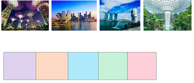
We were tasked to design our very own packaging of Singapore souvenirs from scratch and we needed to cater it to tourists and locals. I started off by coming up with my Singapore story, which was based on my experiences in my childhood. Such as, Travelling around sg, keeping memories (family outings, with friends, etc) and popular places in Singapore (eg. gardens by the bay, Singapore zoo, Sentosa, etc). I wanted to create something that consumers can keep, display or bring around.
Art Direction & Mood Board:
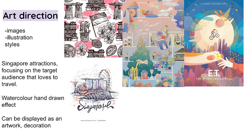

I wanted to include a scrapbook with various graphics that the consumers can fill it up however they want as well as display it as a decoration.
Chosen Packaging:

This is the packaging template I would be using and it is a carrier packaging box that can be closed. It is slightly bigger than A4 to allow space for the scrapbook such as taking into consideration the hard covers, the binder rings and the pages. So this particular design allows people to be able to travel with the scrapbook more conveniently.
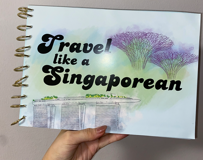
Packaging Design, Front & Back:

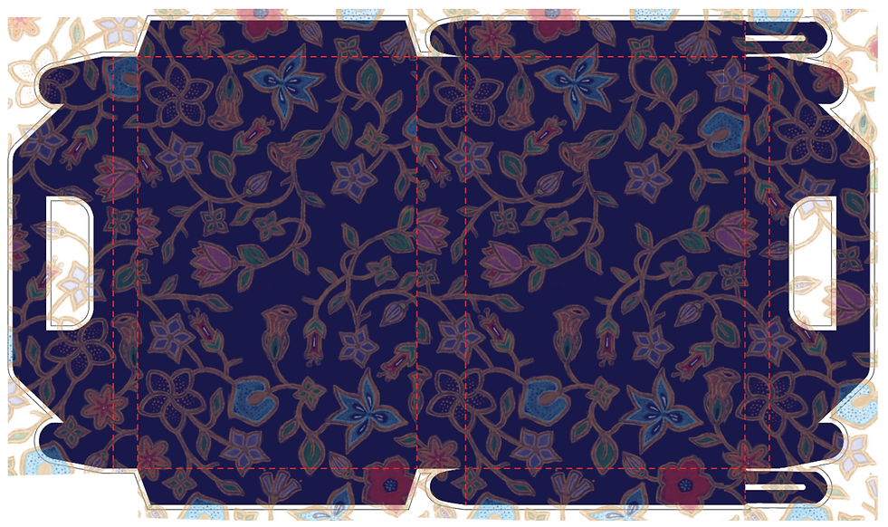
I wanted to take inspiration from the SIA batik design as I think it suits well with my concept since it's about traveling and it is also associated with Singapore. It is also not too jarring on the eyes since the print is not vibrant as I would want the words “Travel like a Singaporean” to be more obvious. The back has a short description of Singapore, our culture, and diversity. I have also added a barcode and the necessary info a product packaging would normally have.
I was happy with my layouts and I went ahead to print them out. The process of choosing the correct paper was difficult as I needed to choose something that is suitable, such as waterproof coating for the packaging and a matte thicker paper around 300gsm for the scrapbook pages. I tried to make sure that the designs go beyond the bleed line so that there are no awkward white boarders.
Packaging:


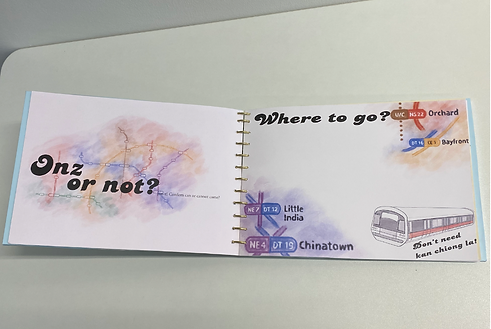
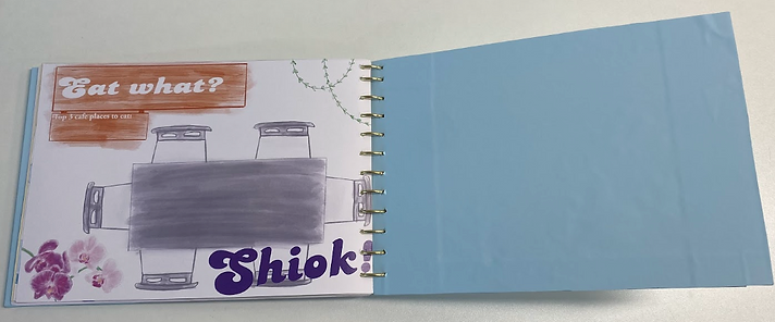
Scrapbook Illustrations:


I felt that using these elements would make the scrapbook more relatable and appealing not only to locals but also tourists as it can remind them or help them to learn more about Singapore’s culture on a deeper level rather than just the usual use of the Merlion, Marina Bay Sands, Gardens by the Bay etc. additionally with the watercolour, hand-drawn effect. It provides a more personal touch instead of something that feels too manufactured.
Scrapbook:
Next, I assembled the scrapbook. The front and back covers are hardcovers and the designs are printed out as waterproof and the pages are A4 sized, printed on white matte 300gsm paper, I used a foam board I already had at home and a blue paper sticker was used to cover the inside and the edges.
I used gold binder rings to hold the book together.


The overall end result ended up being up to par with what I had in mind, it is not the most perfect but I never would have ended up at this point without feedback from my classmates and lecturer. I have also applied some things I learn in the lessons thought like how bleed lines are so important in order to not have any white borders, the material of the paper affects the look of the end product as well. For packaging, it was not easy to assemble it and there were some adjustments that needed to be done as the measurements were not matching up in certain areas. But it still turned out to be quite sturdy which is what I wanted and I think it can hold up quite a long time.